Santander Login Redesign — Regulatory Compliance Without Sacrificing Experience
How I turned an urgent regulatory requirement into an opportunity to improve security and UX across every Santander Argentina digital channel.
UX Design · Banking · Redesign
Context
In late 2023, Argentina's Central Bank (BCRA, Banco Central de la República Argentina) mandated a structural change to banking authentication: every institution had to replace the traditional scheme based on national ID number (DNI) and numeric PIN with a more robust system using an alphanumeric username and a complex password.
This mandate posed a critical challenge. For millions of users, the DNI was synonymous with digital banking access. Changing that paradigm meant not only complying with the regulation, but managing the change in a way that didn't cause friction, confusion or drop-off.
My role: UI Designer
Scope: Home Banking Desktop, Mobile Web, Native App (iOS/Android)
Context: BCRA regulation, 6+ million active users
Tools: Figma, Flame AR Design System
URL: Login Santander Argentina
The Challenge
Before and after: Before, the legacy login with no functional changes and no Flame AR components. After, the new login with new authentication logic, a simpler experience and full BCRA compliance.
Implementing this regulation wasn't a visual refresh: it required a complete redesign of the authentication system, including:
Critical flows:
New user sign-up
Progressive migration from the old credentials
Username and password recovery
Intermediate security checks
Forced change according to the regulatory timeline
Project constraints:
Strict regulatory deadlines
Coordination across multiple areas (Business, Security, Legal, Development)
Simultaneous rollout on three platforms
Minimal impact on existing users
Core problem: How do we move millions of users to a new authentication paradigm without causing frustration, a drop in conversion or an overloaded call center?
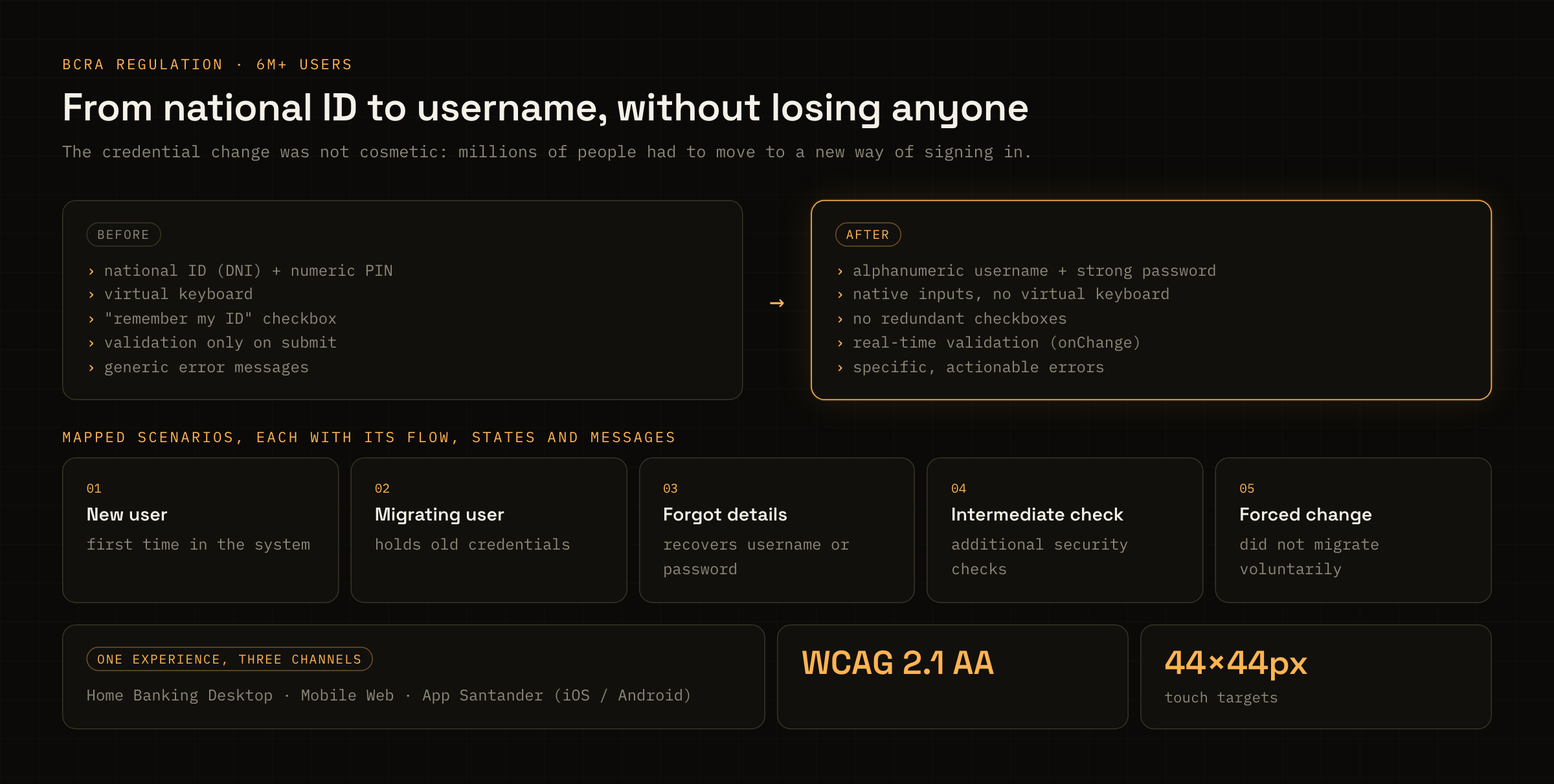
Caption: What changed in the credential and the five scenarios the new flow had to handle.
Research and Discovery
Competitive Analysis and Benchmarking
I ran a thorough analysis of login implementations at:
Local banks that had already migrated
International banks with robust authentication systems
High-traffic digital platforms (fintech, e-commerce)
Key insight: Users associated bank access exclusively with their DNI. Introducing the idea of an "alphanumeric username" without proper context would cause confusion and pushback.
Heuristic Evaluation
I identified recurring problem patterns in banking logins:
No clear feedback in error states
Validation messages that weren't actionable
Fragmented, confusing recovery flows
Poor accessibility (keyboard navigation, contrast, screen readers)
Technical Audit
Together with the security team, I reviewed elements of the existing system:
Virtual keyboard: Obsolete given the dominant usage context (personal devices, mobile)
Validations: Run only on submit, which caused frustration
Error messages: Generic and unhelpful
Strategic decision: I proposed removing the virtual keyboard and moving the flow to native inputs with real-time validation. This decision, backed by usage data and agreed with the security team, made the experience significantly simpler.
Design Strategy
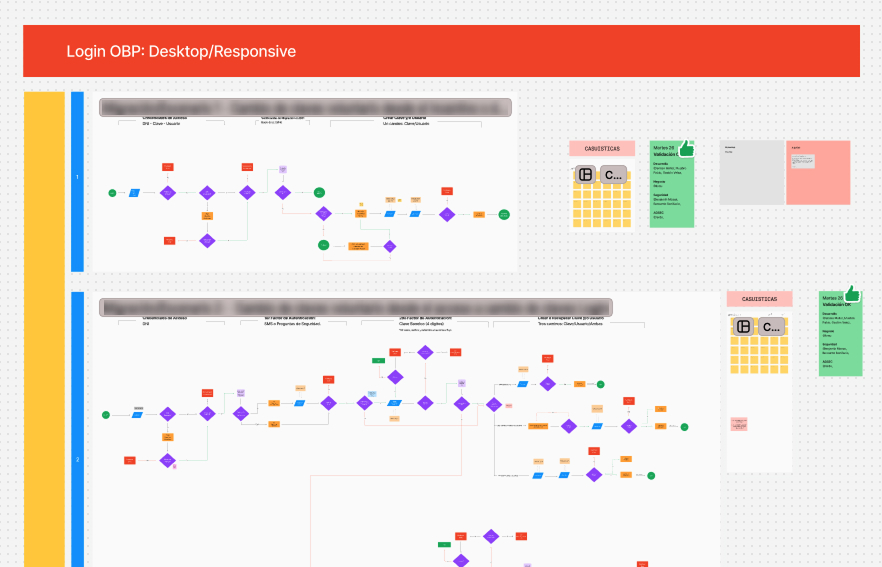 Flow diagrams covering some of the scenarios we mapped.
Scenario Mapping
I worked with Product Owners, Business Analysts and the Security team to document every use case:
New user: Logging in for the first time
Migrating user: Has old credentials and needs to update them
Forgotten details: Username or password recovery
Intermediate validation: Additional security checks
Forced change: Users who didn't migrate voluntarily
For each scenario, I defined the flows, possible states and contextual messages.
Information Architecture
One of the biggest challenges was communicating the change. I proposed adding an intermediate educational component that would:
Explain in plain language why the DNI was no longer required
Spell out how to create the new alphanumeric username
Keep the bank's institutional yet empathetic tone
I worked closely with the content team to make it clear without unnecessary jargon.
Design Principles for the New Login
Lower cognitive load:
Clear visual hierarchy with distinct CTAs
One goal per screen
A logical progression through the flow
Proactive feedback:
onChange validation on inputs
Specific, actionable error messages
Clear visual states (default, focus, error, success)
Accessibility first:
Full keyboard navigation
AA contrast in every state
Correctly implemented labels and aria-labels
A prominent focus indicator
Design Process
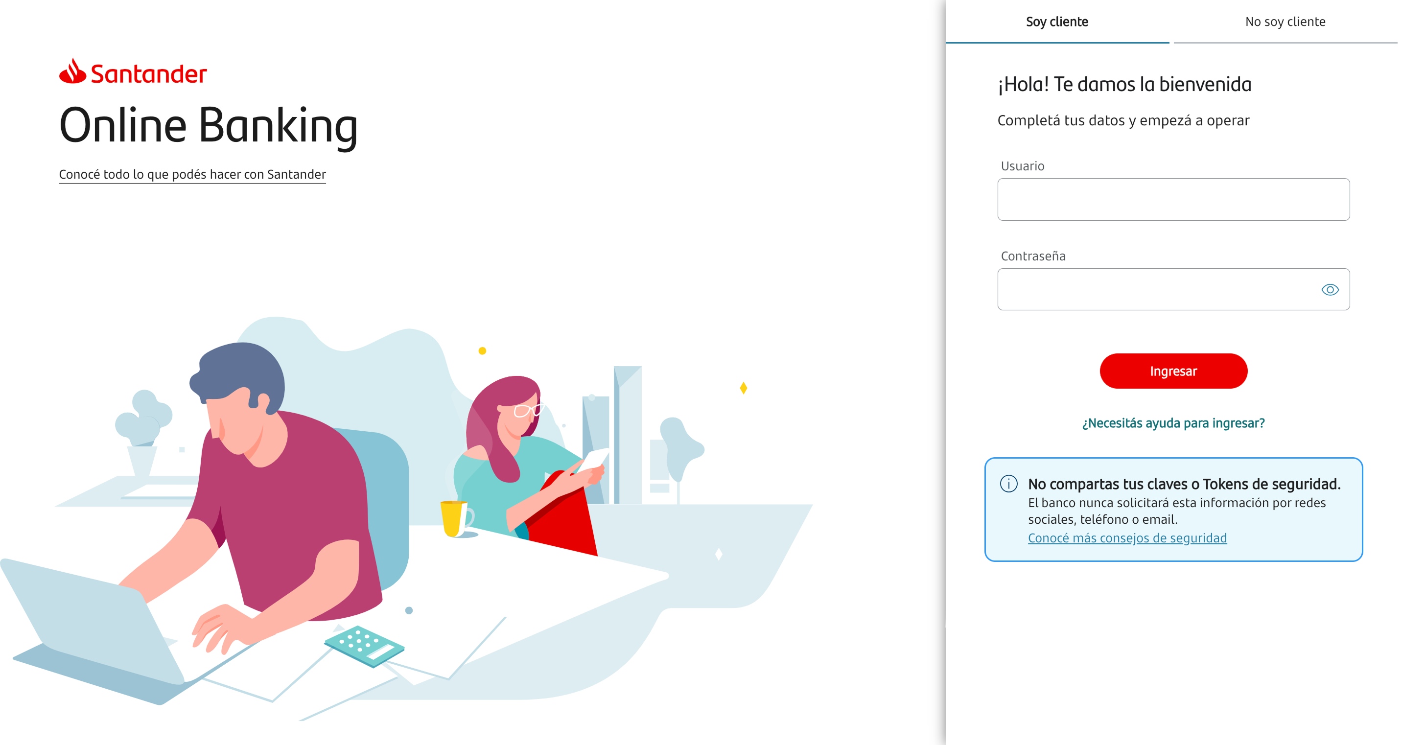 New login: Just 2 authentication factors (no DNI), a simplified recovery flow, typography and content improvements, Flame AR components, removal of redundant checkboxes ("remember DNI") and retirement of the virtual keyboard, among other improvements.
Ideation and Prototyping
I designed several proposals exploring different approaches:
Progressive login (username first, then password)
Unified login (both fields visible)
Variants of educational onboarding
I used Figma with Flame AR components to stay consistent with the bank's digital ecosystem. Each proposal covered the full set of states and responsive behavior for all three platforms.
Accessibility Validation
I worked with the internal accessibility leads to optimize:
Logical tab order
Appropriate screen reader announcements
Minimum touch target sizes (44x44px)
Contrast in error and focus states
This collaboration significantly raised the quality of the design and produced learnings I've applied to later projects.
Testing with Real Users
The interactive prototypes were used to run in-person usability tests at bank branches. This allowed us to:
Validate that people understood the new credential system
Identify friction in micro-interactions
Adjust the tone and content of the educational messages
Spot improvement opportunities early
Testing outcome: Users understood the change when the "why" was explained clearly and in context. The educational component proved essential to reducing anxiety.
Negotiating with Stakeholders
During the process, different areas proposed adding intermediate screens with extra information or complex validations. Well-intentioned as they were, these ideas fragmented the flow and added friction.
I made the case for a simplified flow, with information embedded in context instead of extra screens. My arguments were based on:
Drop-off data from similar flows
UX best practices
User testing results
This negotiation was key to keeping the experience intact.
Implementation and Results
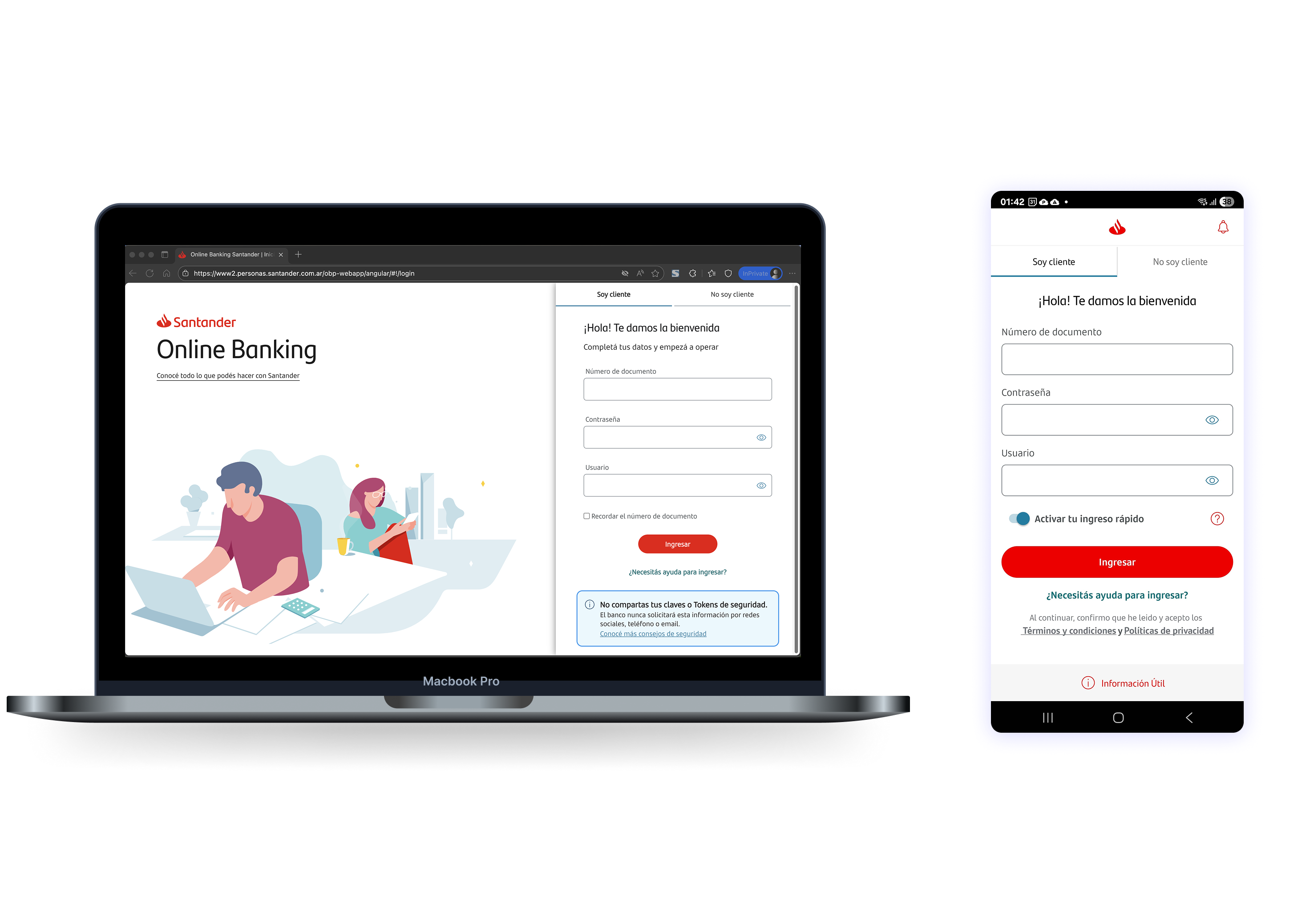 New multi-platform login: Built with Flame AR components for Desktop and App.
Multi-Platform Rollout
The new login system was rolled out in a unified way across:
Home Banking Desktop
Mobile Web
Santander Argentina App
The handoff included:
Detailed per-platform specs
Documentation of interactive behaviors
Design tokens and state variants
Validation criteria and error messages
Measurable Impact
Fewer authentication errors: Users made fewer mistakes entering their credentials thanks to real-time validation.
Fewer call center inquiries: Clear communication about the change reduced the volume of calls about access problems.
Cross-platform consistency: For the first time, all three digital channels offered a unified, coherent login experience.
Better accessibility: The new login met WCAG 2.1 AA standards, making bank access more inclusive.
A foundation to build on: The design accounted for future integration of technologies such as BioCatch and two-factor authentication.
Reflections
Designing Under Regulatory Constraints
This project taught me that regulations aren't obstacles; they're frameworks within which to design creative solutions. The challenge wasn't just complying with the BCRA mandate, but doing it in a way that genuinely improved the experience.
The Importance of the "Why"
Users accept significant changes when they understand the reason behind them. Investing in contextual education isn't a "nice to have"; it's essential to reducing resistance to change.
Negotiating Without Losing Sight of the User
In complex organizations, many areas have legitimate agendas. I learned to negotiate solutions that meet business needs without compromising the user experience, using data and design principles as my arguments.
Accessibility Is Quality Design
Working closely with accessibility specialists didn't just make the product more inclusive; it raised the overall quality of the design. Accessibility considerations often lead to better decisions for every user.
Key Learnings
Context is everything: Understanding regulatory, business and technical dynamics matters as much as mastering design tools.
Data backs decisions: With many stakeholders involved, arguments grounded in research and testing work better than subjective opinions.
Simplicity takes work: Designing simple flows in complex contexts takes more effort than adding screens. Resisting the urge to over-design is a critical skill.
Design systems speed things up: Flame AR let us keep consistency and iteration speed. Without that foundation, the project would have been significantly more complex.
Long-Term Impact
Beyond meeting the BCRA requirement, this redesign set a new quality bar for critical flows at Santander Argentina. The patterns, components and learnings it produced were later applied to other projects across the digital ecosystem.
Redesigning a login may look like a small change, but here it meant transforming the front door to digital banking for millions of users. Balancing security, regulation and experience was the real challenge.
This project reinforced my belief that the best design solves real problems within real constraints, without losing sight of the people who will use it.