Sidebar Redesign — Scalable Navigation for the Business Banking Ecosystem
How we turned a critical, degraded component into a modular, accessible navigation system built to scale and grow across multiple internal products.
Design System · Component · Banking

Context
In banks with multiple business segments, navigation systems tend to evolve in a fragmented way. Each area adds sections to suit its own needs, with no coherent architectural vision behind them. The result: overloaded, inconsistent menus that are hard to scale.
The Business Banking (Banca Empresas) Sidebar at Santander Argentina had exactly this problem. Designed years earlier for a simpler ecosystem, it had piled up patches and workarounds that left it outdated both visually and functionally.
As part of a strategic initiative to modernize the business digital experience, the decision was made to redesign this component from the ground up.
My role: UI Designer (Retail Banking team, collaborating with Business Banking)
Scope: Business Home Banking - Desktop and Mobile
Tools: Figma, Flame AR Design System
Collaboration: UX Research, Content, Development, Accessibility
The Problem
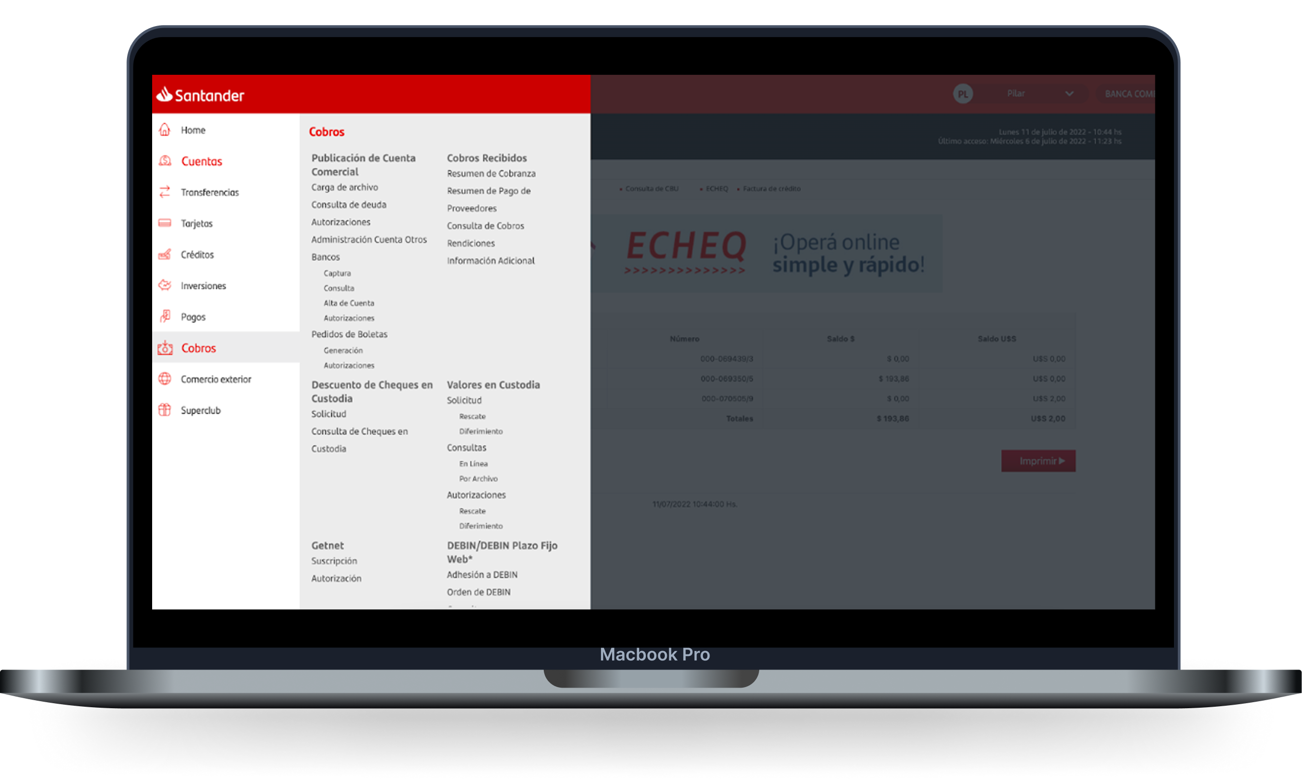
Legacy menu: No functional changes and no Flame AR components. Plenty of room for improvement.
The existing Sidebar had structural problems that affected both users and the organization:
Confusing information architecture:
Groupings with no clear logic
Inconsistent naming across sections
Poorly defined visual hierarchy
Poor user experience:
Interactions with no visual feedback
Abrupt transitions between states
Keyboard navigation that didn't work
No screen reader support at all
Technical limitations:
Hard-to-maintain code
No way to add new sections without breaking the layout
No consideration for mobile contexts
Not ready for upcoming features (multi-account, badges, tags)
Core problem: The most critical navigation component in the business product had become an obstacle to the evolution of the digital ecosystem.
Research and Diagnosis
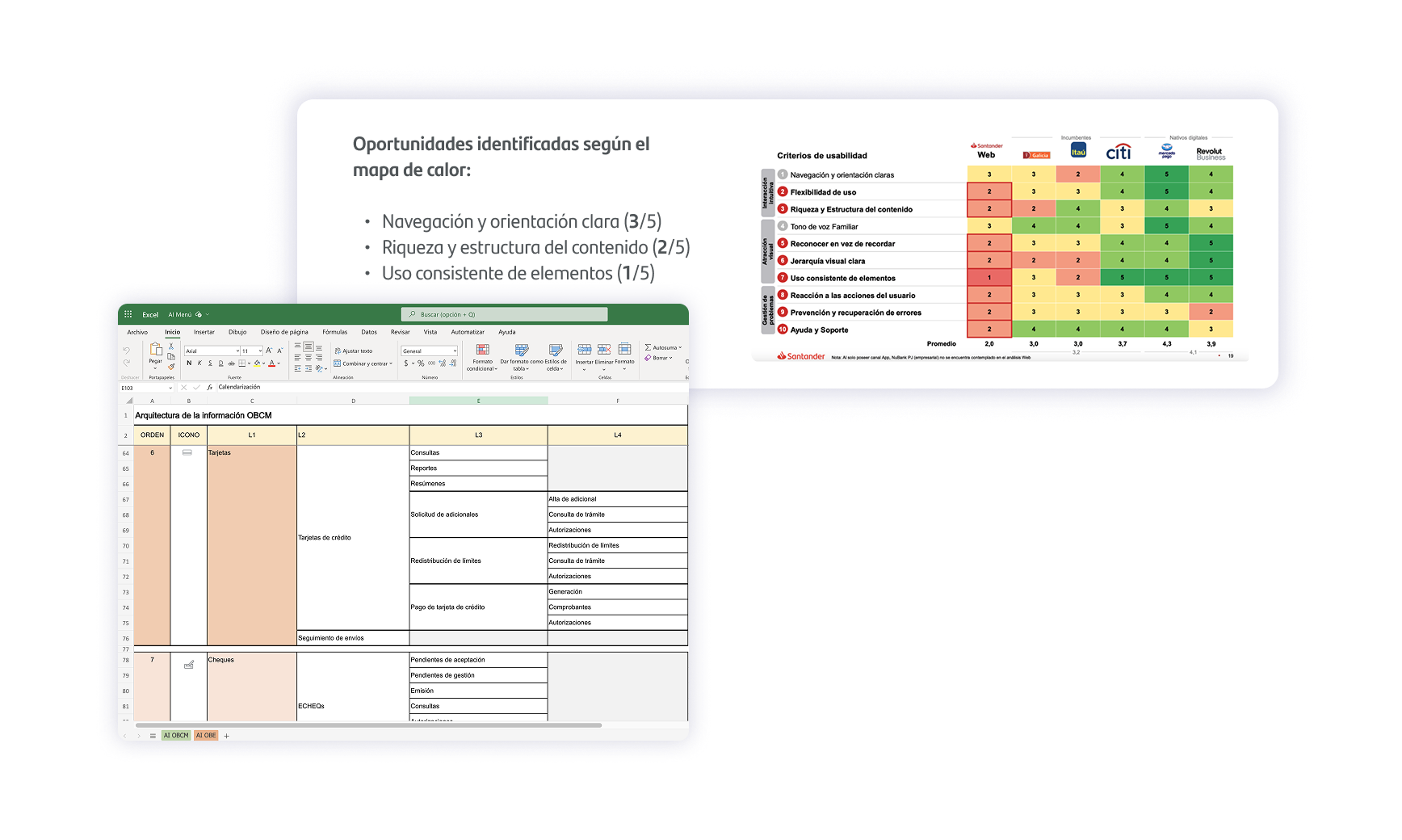 Research: Usability analysis and information architecture validation.
Content and architecture audit
The Research and Content team ran a thorough survey of:
Every active section in the menu
Naming conflicts and redundancies
Usage patterns by user profile
Logical hierarchy vs. perceived hierarchy
This work was essential to defining a new information architecture built around clarity and scalability.
Behavior Analysis
I identified problematic patterns in the existing system:
Users confused by the lack of an active-section indicator
Difficulty telling hierarchy levels apart
Unclear visual transitions when expanding/collapsing sections
Inconsistencies between the Desktop and Mobile versions
An Opportunity to Reuse
I realized that the List component I had designed earlier could serve as the architectural foundation for this Sidebar. Its principles of modularity, flexibility and well-defined states were exactly what we needed.
This strategic decision would not only speed up the design work but also strengthen the consistency of the Flame AR system.
Design Strategy
Guiding Principles
I defined four pillars to guide every design decision:
Clear hierarchy: Each navigation level had to be visually distinguishable without any interpretation.
Constant feedback: Users should always know where they are, what they can do and what is happening.
Accessibility first: The component had to be usable with a keyboard, screen readers and other assistive technologies.
Technical scalability: The solution had to be able to grow without structural redesigns.
Component Architecture
I structured the Sidebar in modular layers:
Visual base: Reuse of the List component, with specific adaptations for navigation.
State system:
Default
Hover
Active (current section)
Focus (keyboard navigation)
Collapsed/Expanded
Supporting elements:
Notification badges
Semantic icons
Active-section indicators
Smooth transitions between states
Context variants:
Desktop expanded (full navigation visible)
Desktop collapsed (icons only)
Mobile (side drawer)
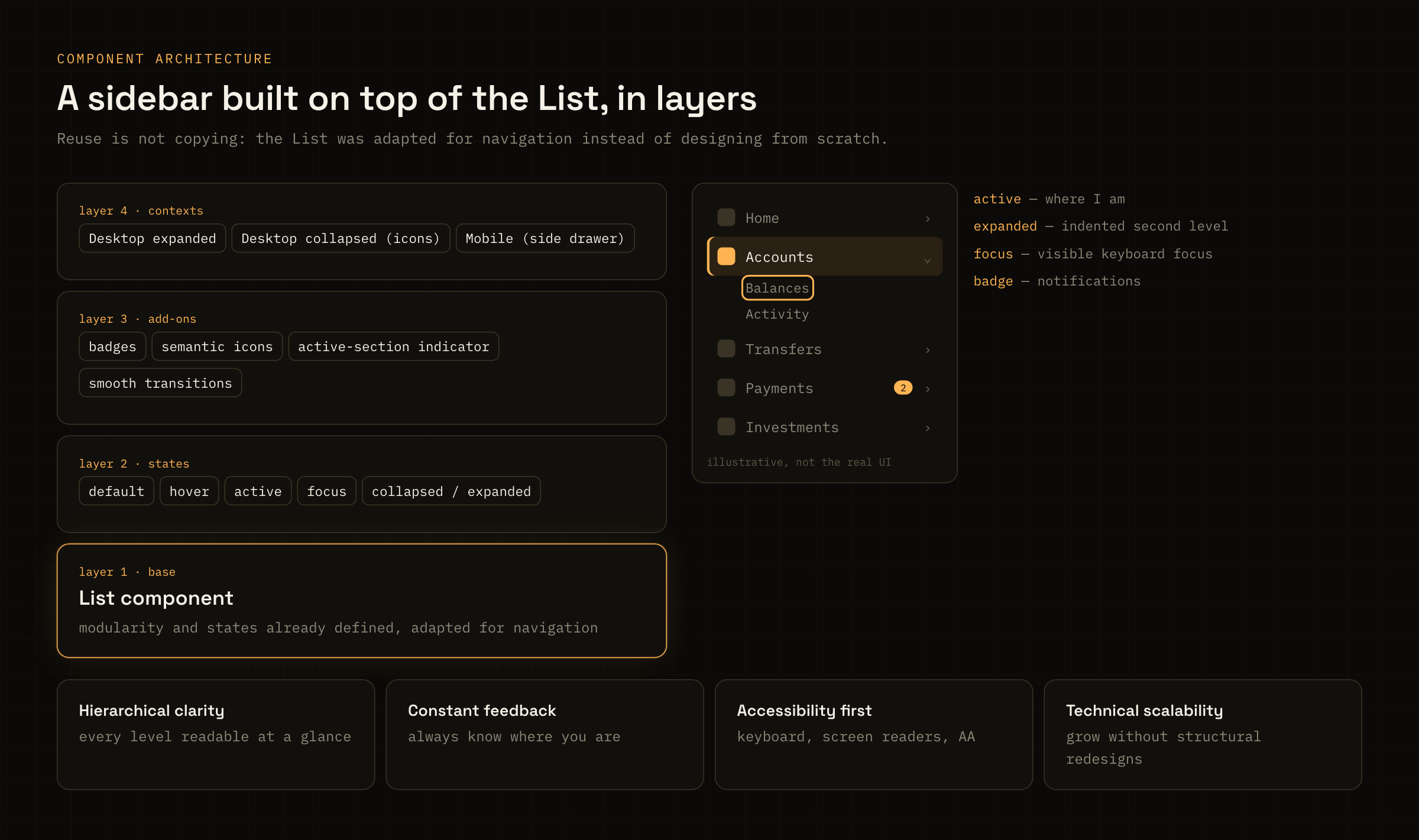
Caption: The List as the base and three layers on top: states, add-ons and contexts.
Design Process
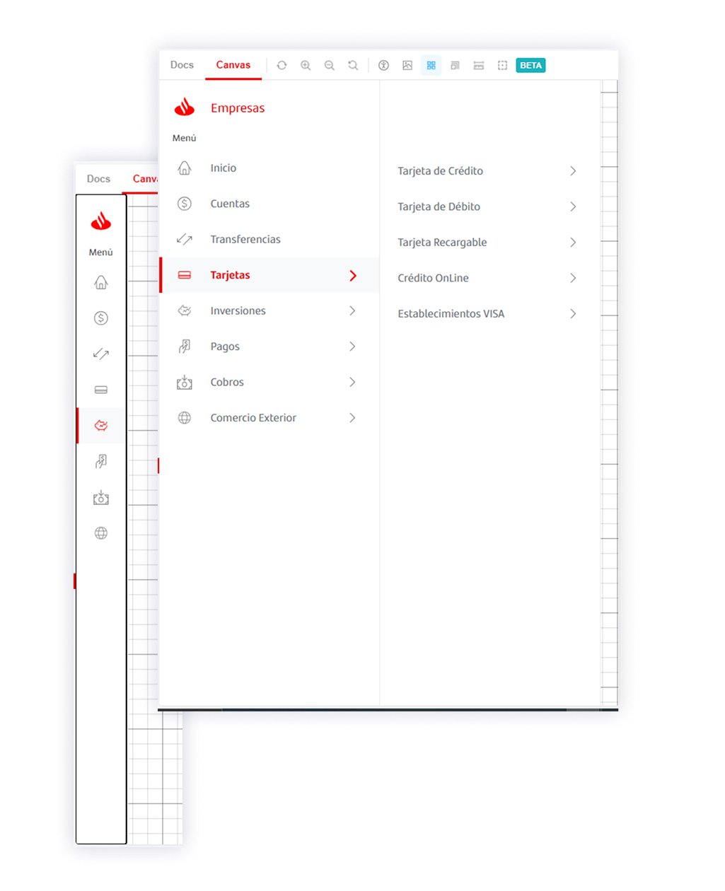 Storybook: The component as presented in the Design System's official library, used by both the Development and Design teams.
Visual Design and Micro-interactions
I focused heavily on the Desktop version, the most degraded and the most used. My work centered on:
Clear visual hierarchy:
Deliberate use of typography, weight and spacing
Visual indentation for secondary levels
Color to differentiate states, without relying on color alone
Meaningful micro-interactions:
Smooth transitions when expanding/collapsing sections
Immediate hover feedback
A subtle animation on the active-section indicator
Clearly visible focus transitions
Consistency with Flame AR:
The system's color, spacing and typography tokens
Base components reused wherever possible
Interaction patterns aligned with the rest of the ecosystem
Accessibility Validation
I worked closely with the internal accessibility leads to ensure:
Keyboard navigation:
Logical tab order
Shortcuts to expand/collapse sections
Escape to close the menu on mobile
Screen readers:
Correctly implemented ARIA roles
Announcements when the section changes
Descriptive labels on icons
Contrast and visibility:
AA contrast verified across all states
A prominent focus indicator with sufficient contrast
Indicators that don't depend on color alone
Testing and Refinement
The interactive prototypes were used in guerrilla usability tests with the bank's internal users. The insights led to adjustments in:
How certain sections were grouped
Icon choices (some weren't immediately recognizable)
Animation timing (some felt slow)
Visual feedback in the collapsed state
Implementation and Results
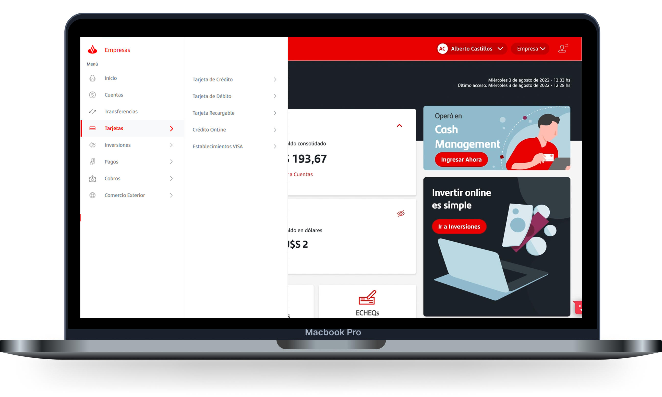 Final result: The new Sidebar Menu in production. Santander Empresas.
Documentation and Cross-Platform Rollout
The new Sidebar was rolled out in a unified way across:
Business Home Banking Desktop
Business Mobile Web
Ready for integration into future native apps
The developer handoff included:
Detailed behavior specs
Design tokens and the full set of variants
Edge case documentation
Technical accessibility criteria
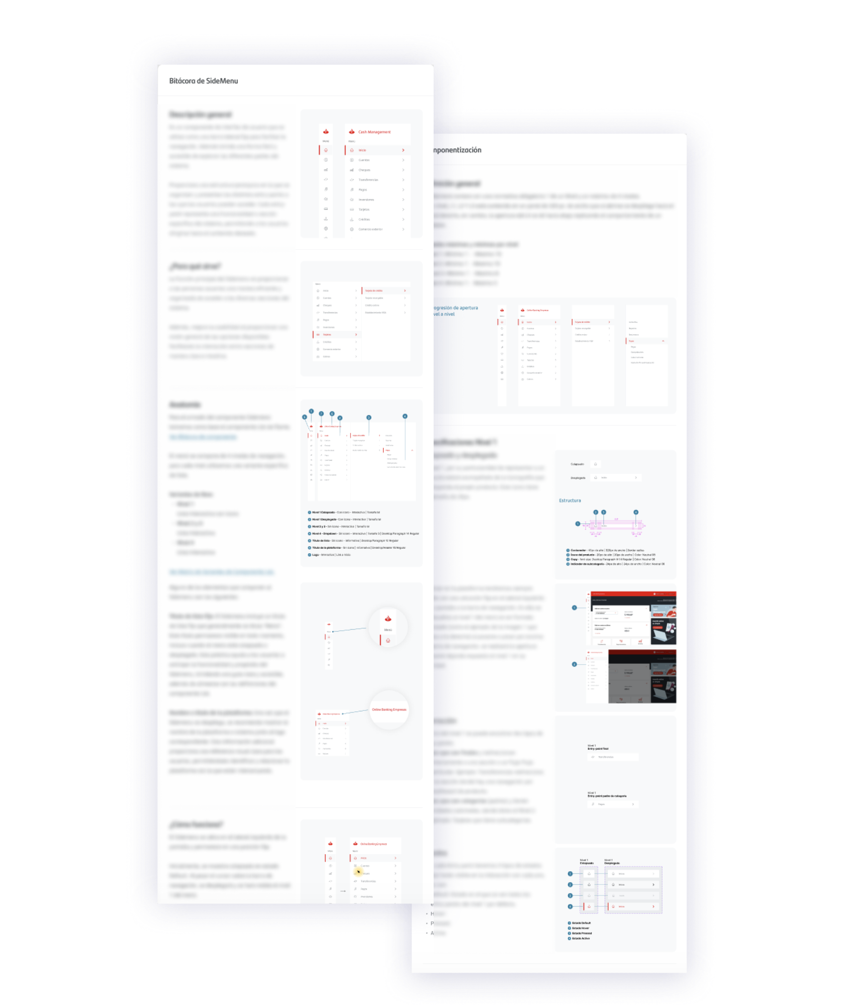 Documentation: An excerpt from the Sidebar Menu log (Bitácora), accepted as official technical documentation.
Impact of the Redesign
Clearer navigation: Users could tell where they were in the system and move between sections with more confidence.
Proven scalability: The new component absorbed new sections without any structural changes.
Better accessibility: For the first time, users with accessibility needs could navigate Business Home Banking on their own.
Internal reuse: Other teams adopted the component for similar projects, validating its modular design.
Less technical debt: Cleaner, better-documented code made maintenance and future iterations easier.
Final Thoughts
Reusing Is Not Copying
This project showed the value of designing truly modular systems. The List component wasn't "copied" into the Sidebar; it was thoughtfully adapted. Knowing when to reuse, when to adapt and when to start from scratch is a critical skill in systems design.
Accessibility Makes Design Better for Everyone
Every accessibility consideration we implemented (clear focus, immediate feedback, obvious hierarchy) improved the experience for all users, not just those with accessibility needs. Accessibility isn't a checkbox; it's a quality multiplier.
Designing for Growth
In enterprise products, scalability isn't optional. A navigation component that can't grow is doomed to be redesigned over and over. Time spent designing for future scenarios saves exponentially more effort in the long run.
Cross-Disciplinary Collaboration as an Advantage
This project brought in research, content, development and accessibility from day one. That range of perspectives didn't slow the process down; it made it richer. Each discipline contributed insights that led to a better final product.
Key Learnings
Navigation components are infrastructure, not decoration. They need the same architectural rigor as the code that implements them.
The business context has specific needs. Business Banking users have different expectations from Retail Banking (Banca Individuos) users. Understanding those differences is crucial.
Modularity is proven through use. A truly modular component is one that other teams can reuse without needing the original designer.
Documentation is part of the design. A well-designed component that is poorly documented is a poorly designed component.
Long-Term Impact
The new Sidebar became a standard component of Santander Argentina's business digital ecosystem. Its modular architecture let the product evolve without creating new technical debt.
Beyond the direct impact on the user experience, this project established a cross-disciplinary way of working that was replicated in later initiatives.
Designing a side menu may look like a minor task, but when that menu is the entry point to every financial operation for thousands of companies, every pixel matters.
This project reinforced my belief that the best systems design is the kind others can extend without compromising its integrity.